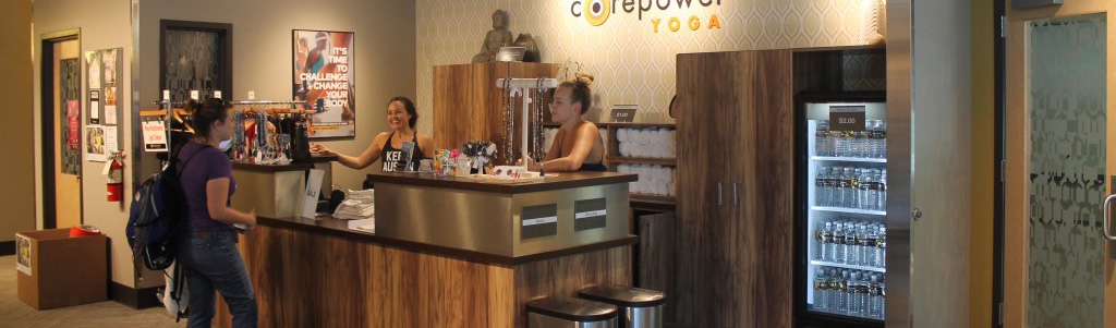
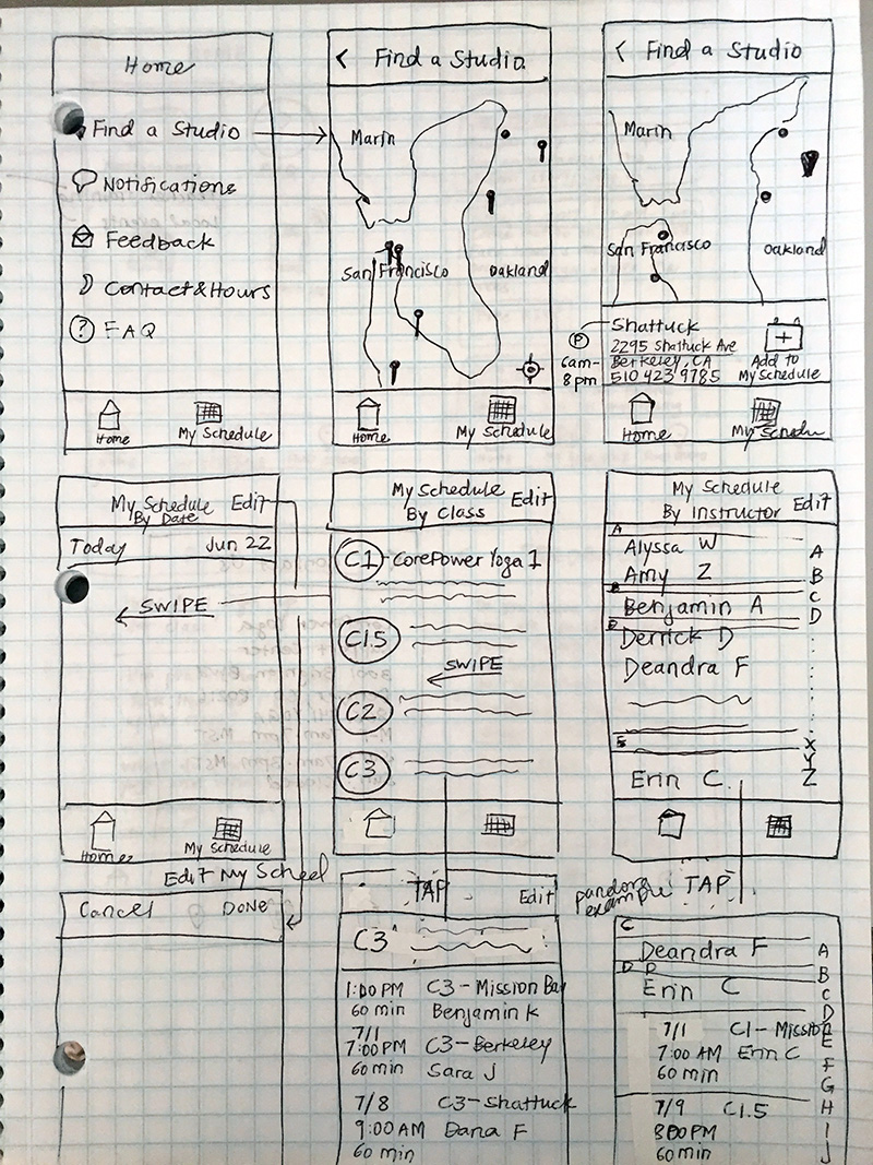
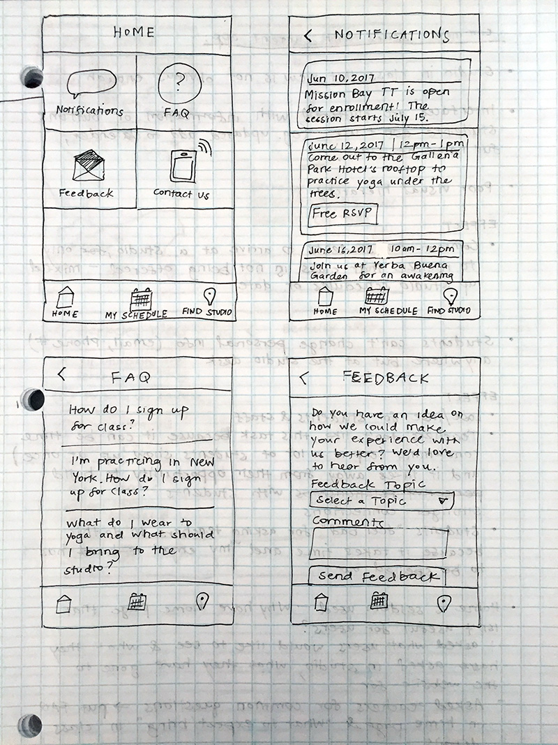
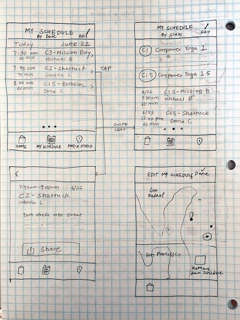
CorePower Yoga
Redesigning CorePower Yoga's mobile experience
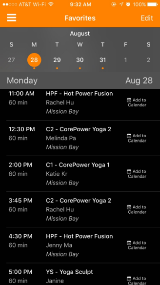
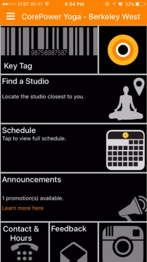
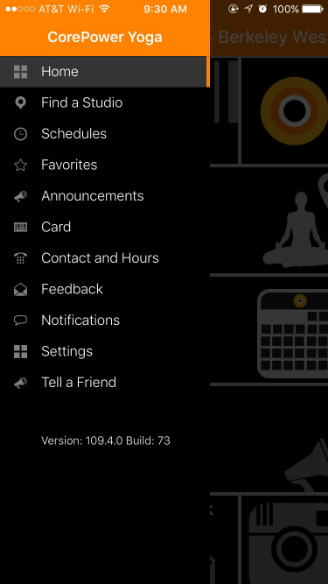
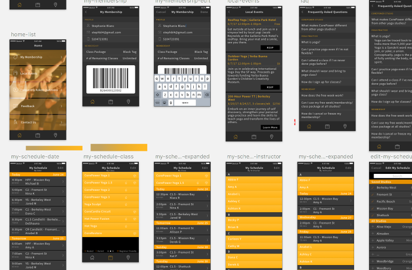
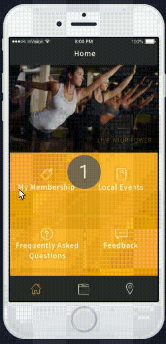
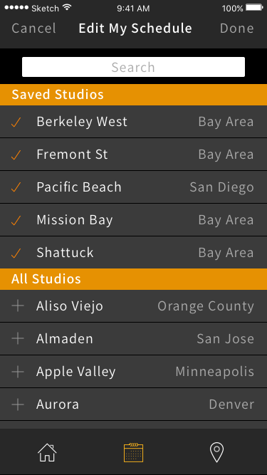
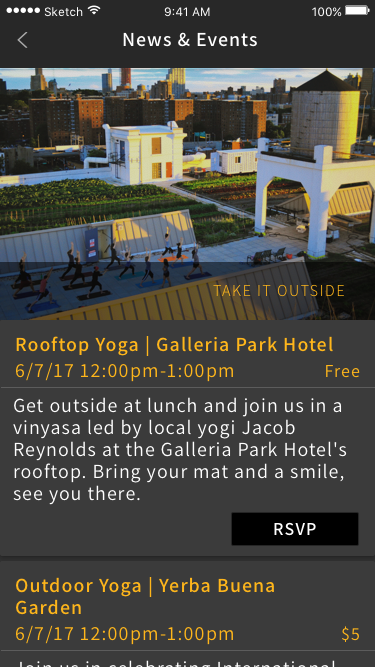
The existing CorePower Yoga mobile app does not serve their brand well. While the studio experience is fluid and refined, the app is redundant, vague, and disconnected from the overall feel of a CPY studio.
From a usability standpoint, there are a number of jarring no-nos. I set out to solve these issues by redesigning the mobile app.
View prototypeM-SHARP
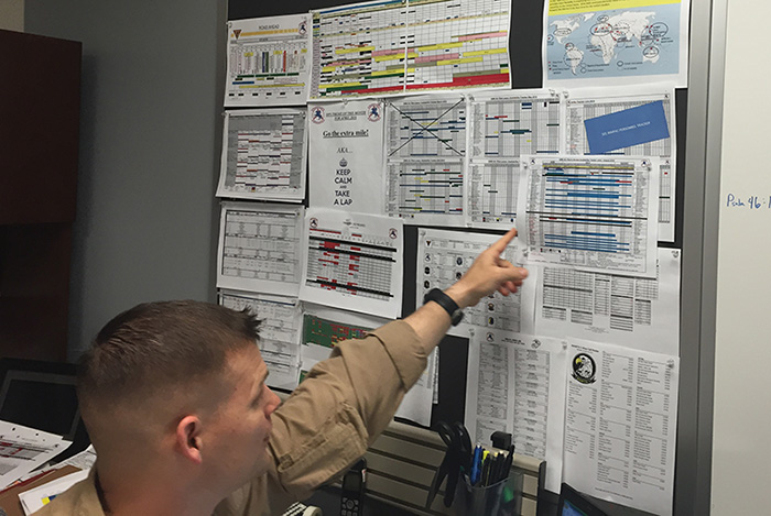
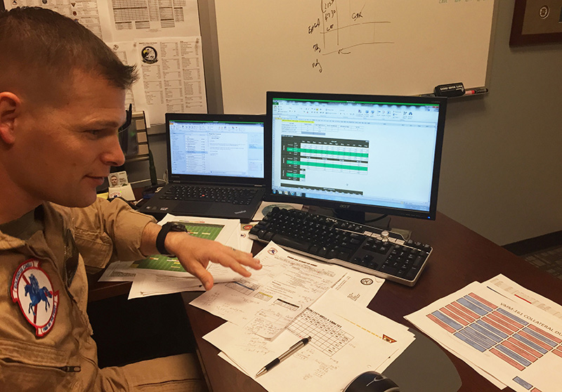
Training management and readiness reporting for Marine Corps aviation operations
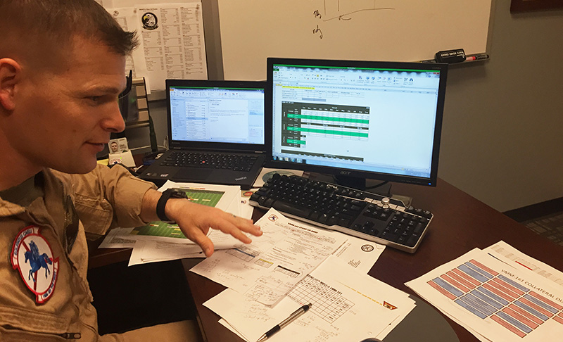
M-SHARP is a web app designed to enable 150+ Marine Corps aviation units to manage training, manage resources, and assess their overall combat readiness.
Myself and one designer pioneered UX design and research practices on this team.
This project is under a strict NDA, but I would gladly discuss it further if you are interested.
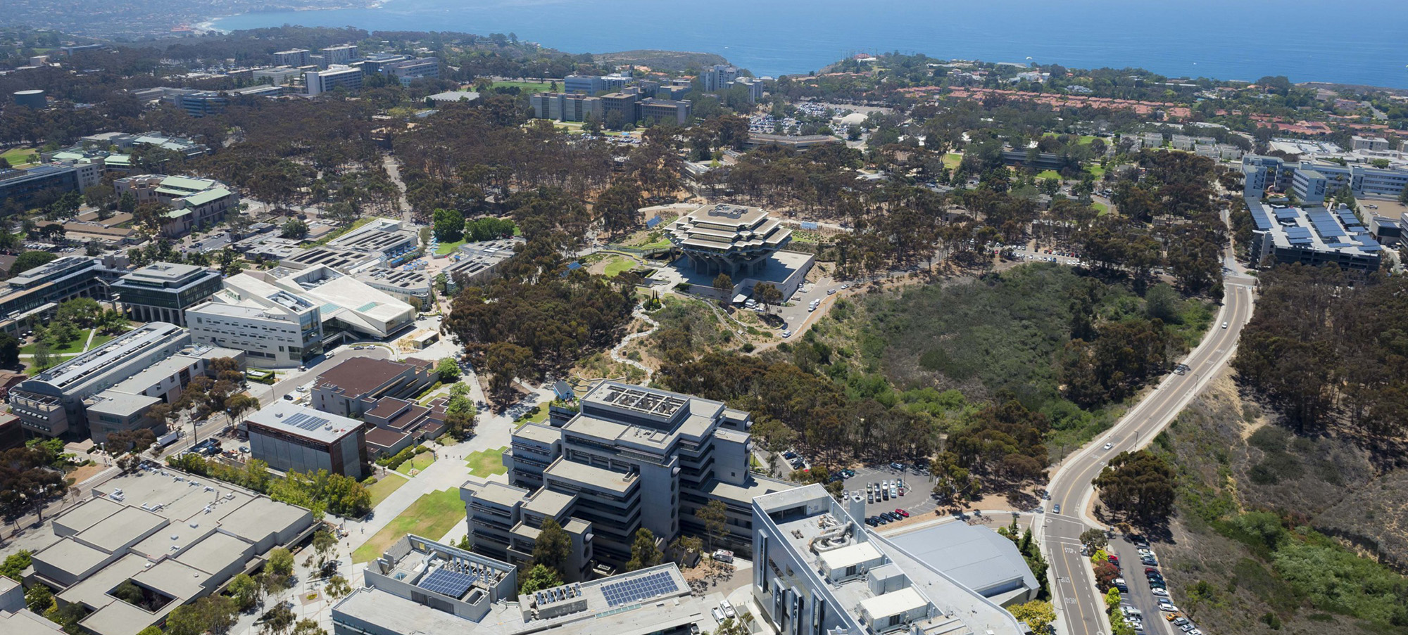
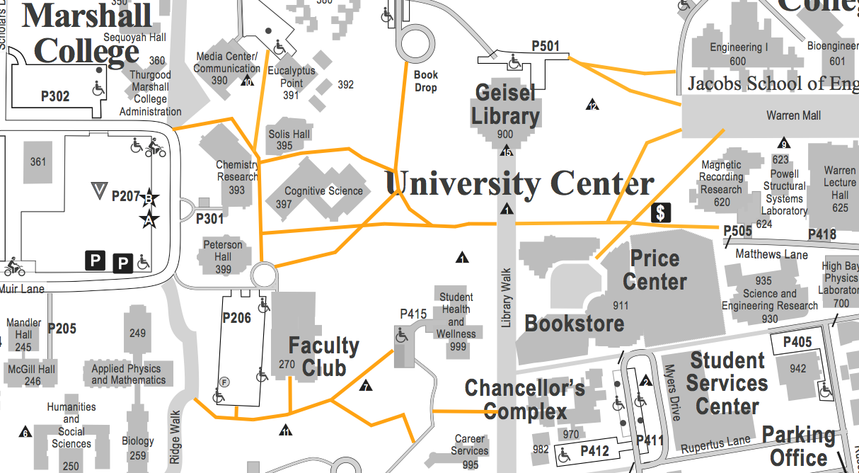
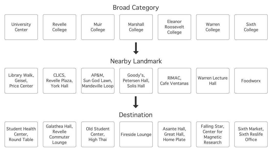
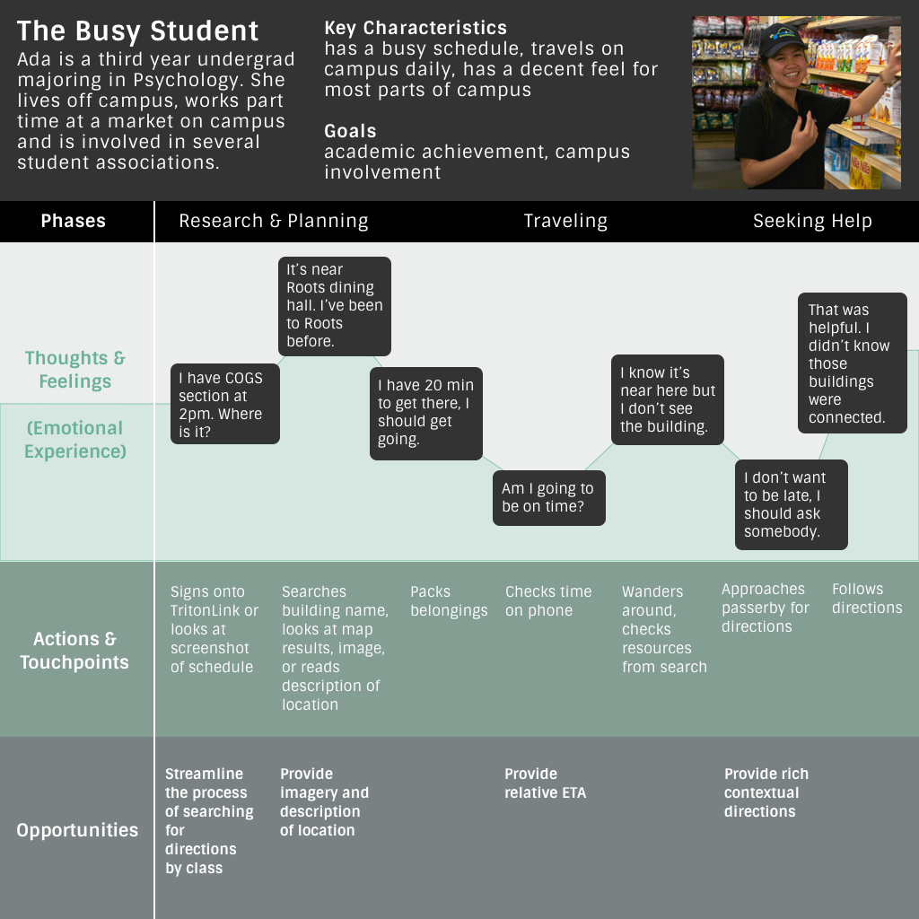
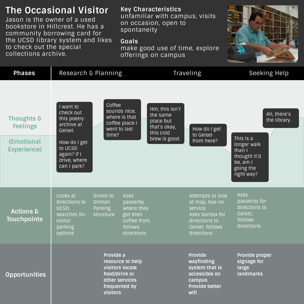
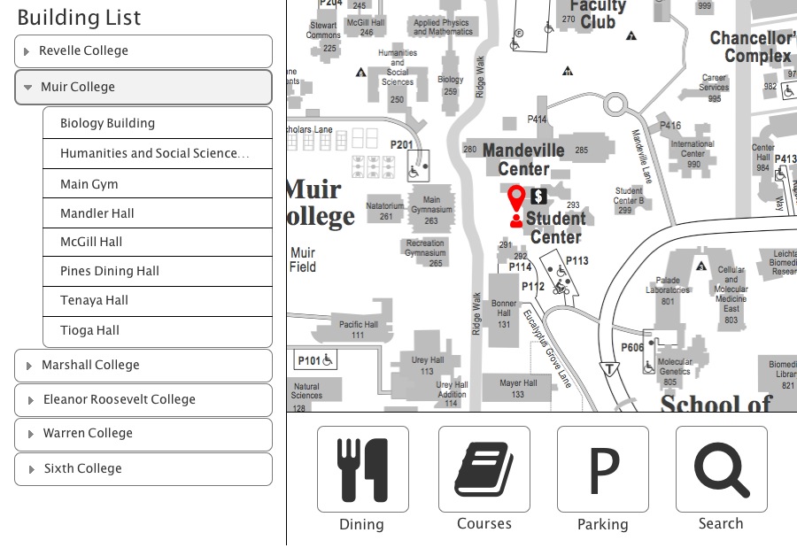
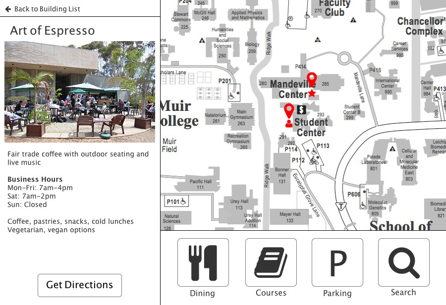
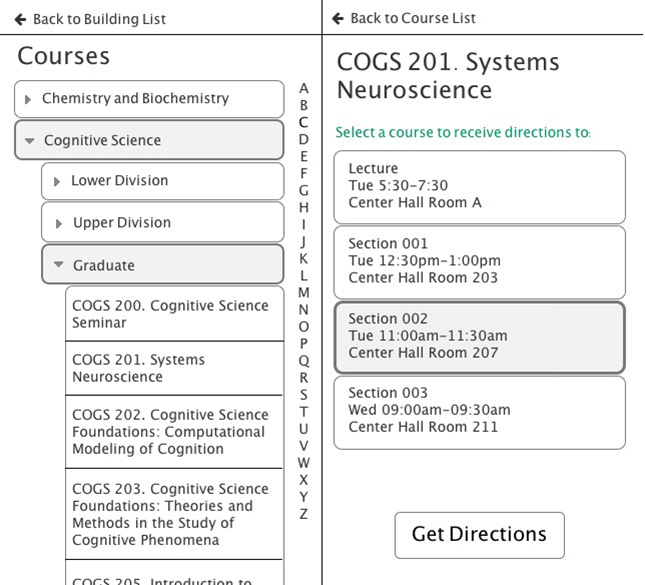
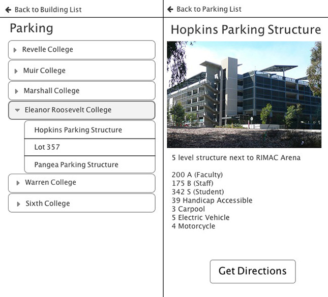
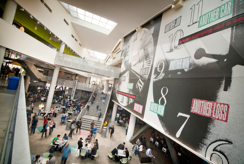
Umap
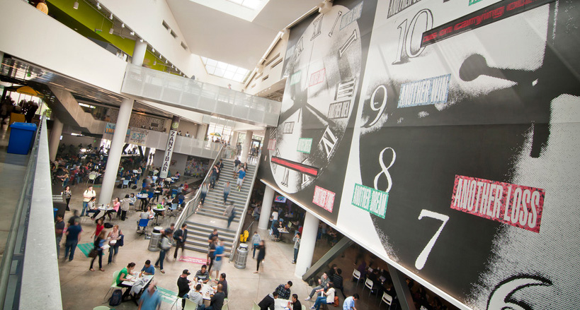
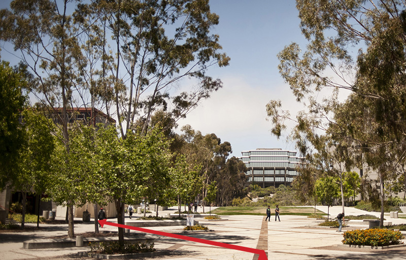
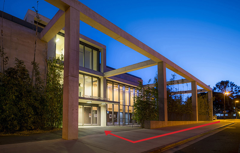
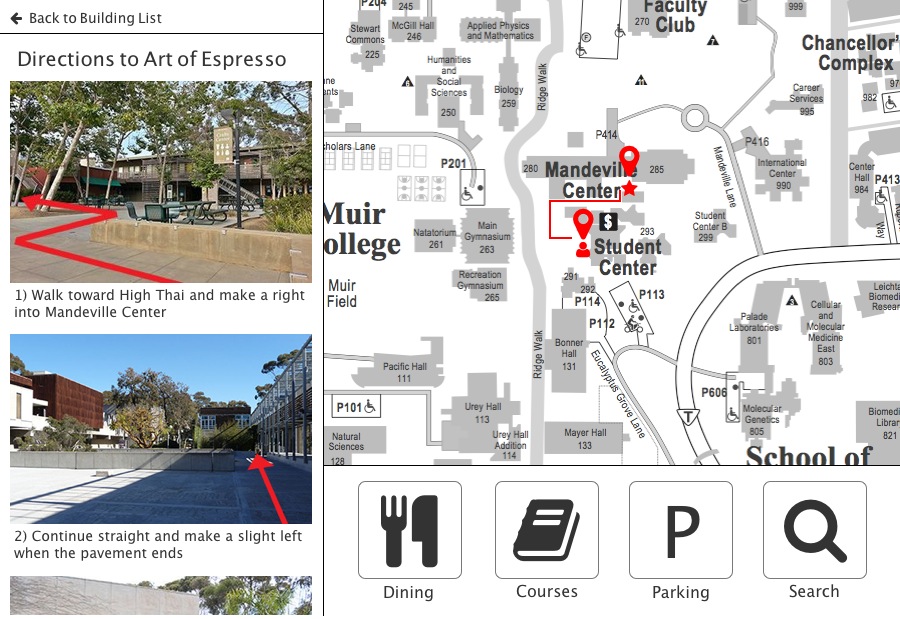
A wayfinding system to facilitate navigation around UC San Diego
With upwards of 750 buildings sprawled across 1,100 acres, UCSD proves to be a complex space to navigate. At the same time, the campus attracts a variety of people, from well-acquainted locals to first-time visitors. Irrespective of familiarity, well-designed wayfinding resources are crucial to how all users experience the physical space.
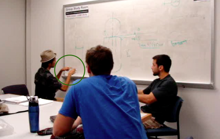
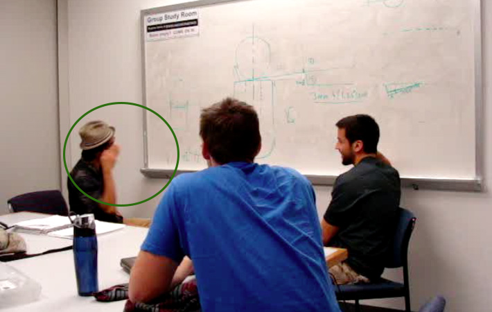
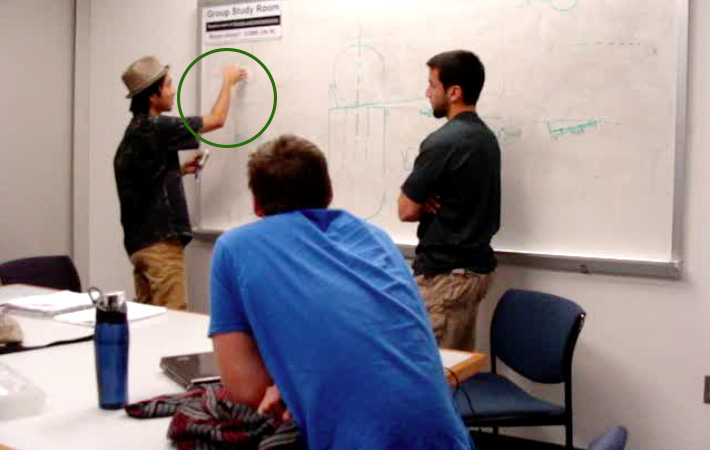
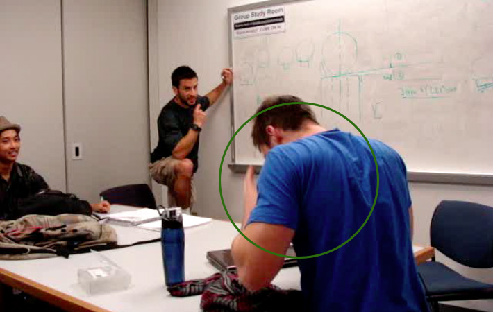
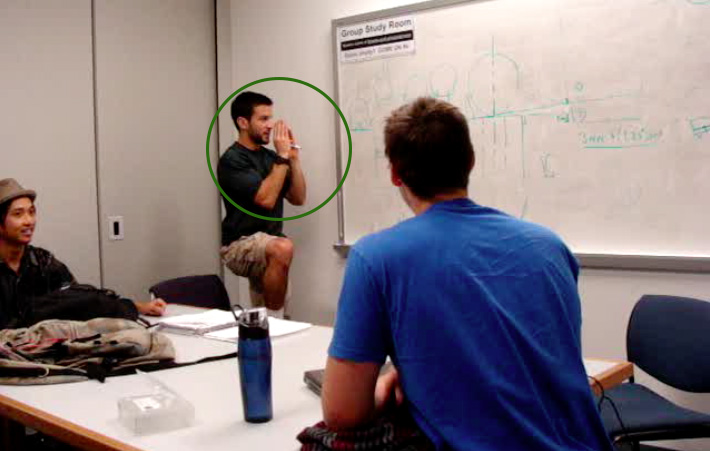
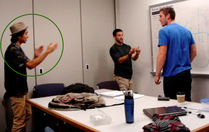
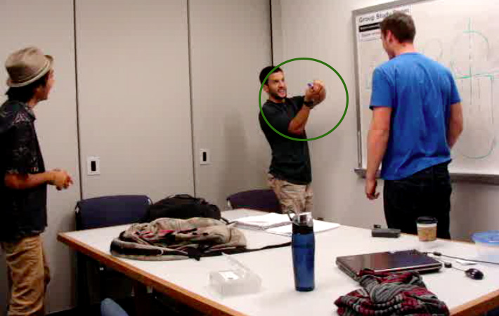
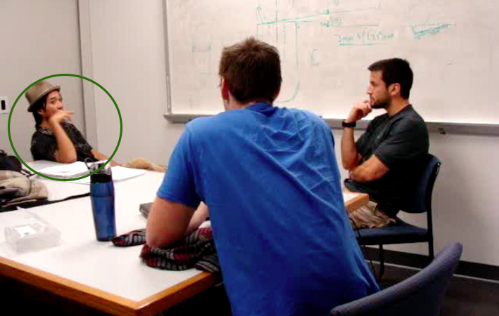
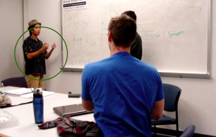
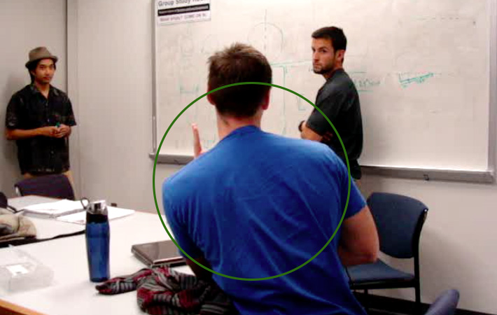
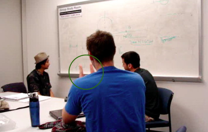
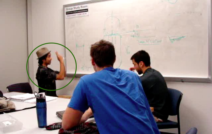
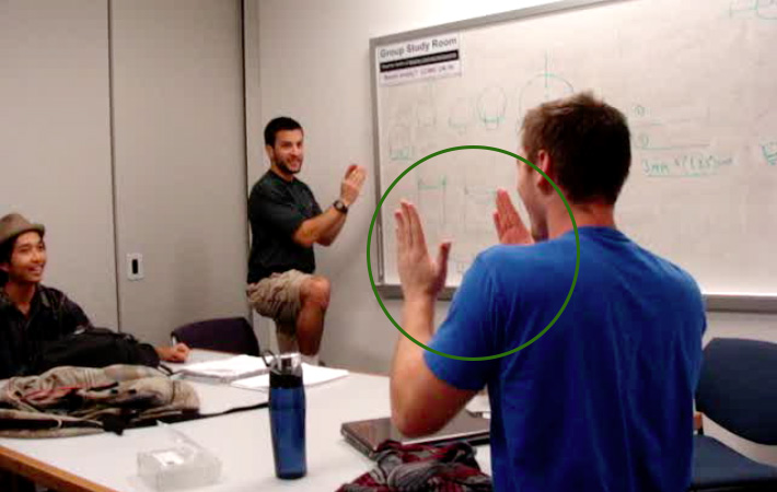
The Ecology of Meaning
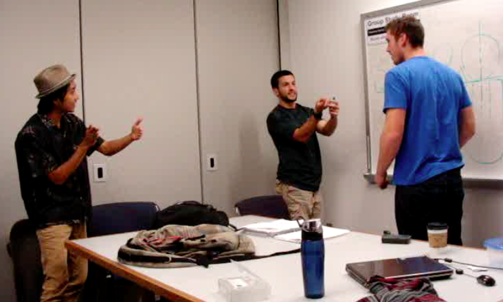
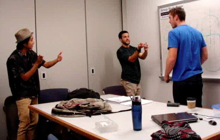
Exploring the impact of gesture in the construction of meaning
The process of developing a shared understanding between a group of individuals can be a difficult one that requires communication beyond spoken language. What can we learn about perspective and intent by leveraging gesture as a visual form of communication?